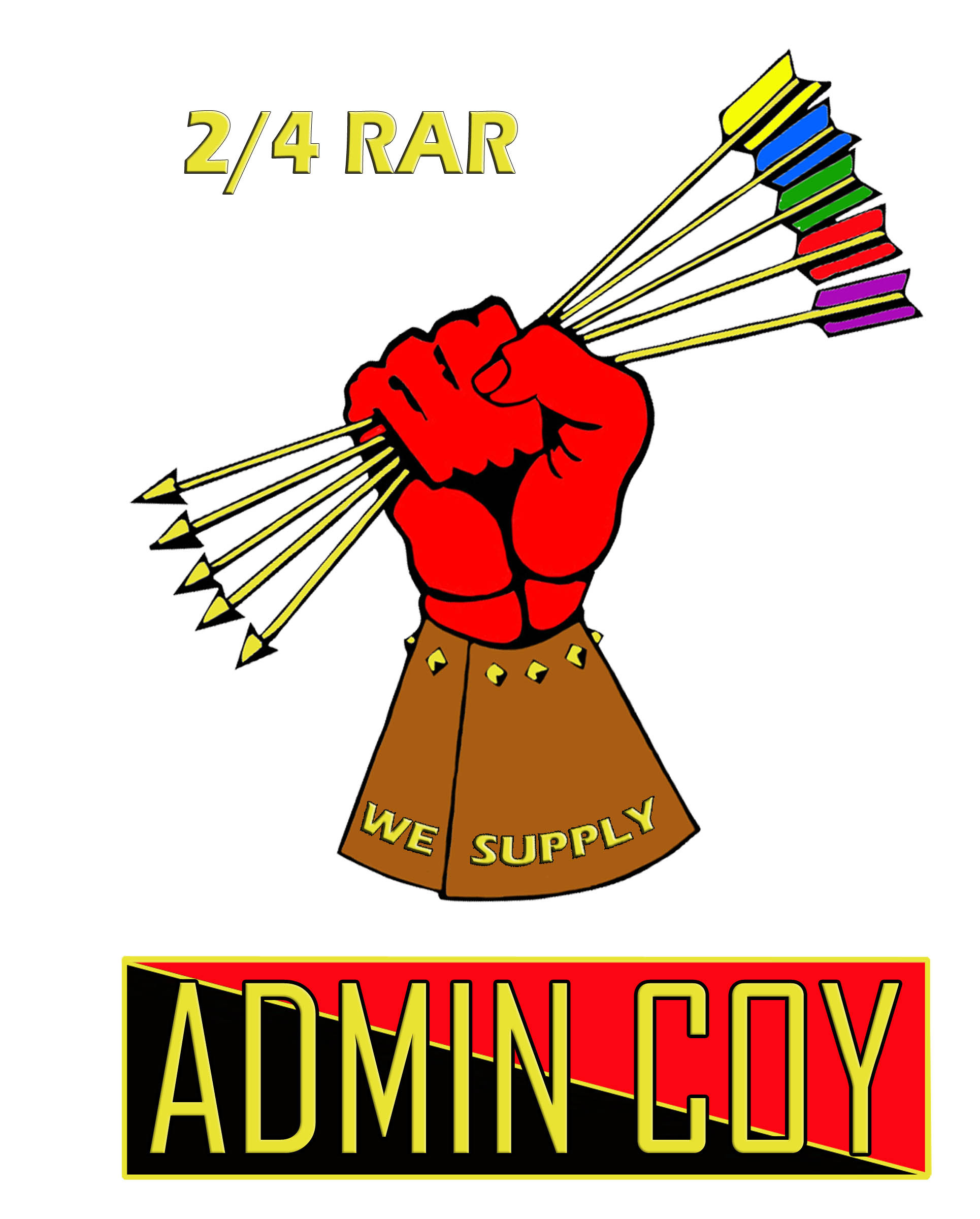
HISTORY OF THE ADMIN COY LOGO
#1 – I designed the Admin Company Logo based off the medieval knights and the gauntlet glove they wore with their armour.
I use each company’s colours as the arrows, and the gauntlet brown for Admin Company. The grasping the arrows showing a strong support being provided to all.
The thought behind it was of running the gauntlet, whether in operations, exercises or at base we support.
The design had to be approved by COY HQ in 1981/82. not sure now on exact date. Once the design was approved I drew it up, as I enjoyed sketching and drawing. Once it was finished I painted it.
Peter Kiernan
#2 – To the best of my knowledge, the Admin Company logo (the mailed fist clutching the five arrows with each coloured fletching indicating a separate company colour) was conceived and designed by WO2 William (Jock) Gall, Pipe Major of 2/4 RAR Pipes & Drums in conjunction with Sgt Alan (Foxy) Grey and myself Cpl Trevor (Zeb) Davis in the mid to latter part of the 1980’s.
If I remember correctly, the logo was submitted to Major Wheatley, our then Company Commander who approved its establishment as the official company Logo.
I am happy to stand corrected with regard to the Company Commander at the time as it may have been Major Guy.
CPL Davis
Subnote on meaning of Mailed Fist – Someone who rules or controls something with a mailed fist is in absolute control and tolerates no dissent. A mailed fist in a velvet glove is used to describe someone who appears soft on the outside, but underneath is very hard.